Ship content, not JavaScript
Building a personal website with Astro, Vercel, and opt-in complexity
Backend development is my comfort zone, and I definitely wouldn’t call myself a web designer. The last time I tried building a personal website was in 2012, and it sucked! I have distinctive taste, but hate learning UI/UX frameworks. Enter LLMs — let’s try again, on a modern stack.
Tech Stack
Let’s define good as, “how little friction is there between drafting a blog post, and seeing it live on the web?” If it’s annoying to publish, I won’t do it. Every decision here was guided by that.
Astro was purpose-built for content sites — everything is pre-rendered at build time, and JS only ships when you explicitly ask for it. Feels pretty snappy, right?
For hosting, Vercel was a no-brainer. I love DevOps in my professional work, but for this project, I just need it to work. I stood this site up in three clicks, and haven’t thought about it since. Preview URLs are great for feedback too, but honestly, I usually just ship straight to production.
No persistence layer — no comments, no likes, no bells and whistles. Hate my ideas? Tell me on X; I need to build a presence there anyway. Fewer moving parts means fewer security concerns, and more freedom to experiment with UI/UX.
For content, I went with MDX because I love writing in Notion. Posts stay readable as plain text, but I can drop in a custom component or styled callout without breaking out of the writing flow.
Now let’s talk about the fun stuff!
ASCII art
The homepage features a huge ASCII art headshot, with some subtle animations. I got the idea after seeing a beautiful Vestaboard at Goose Island Brewing in Chicago (some people call these a “split-flap board”).
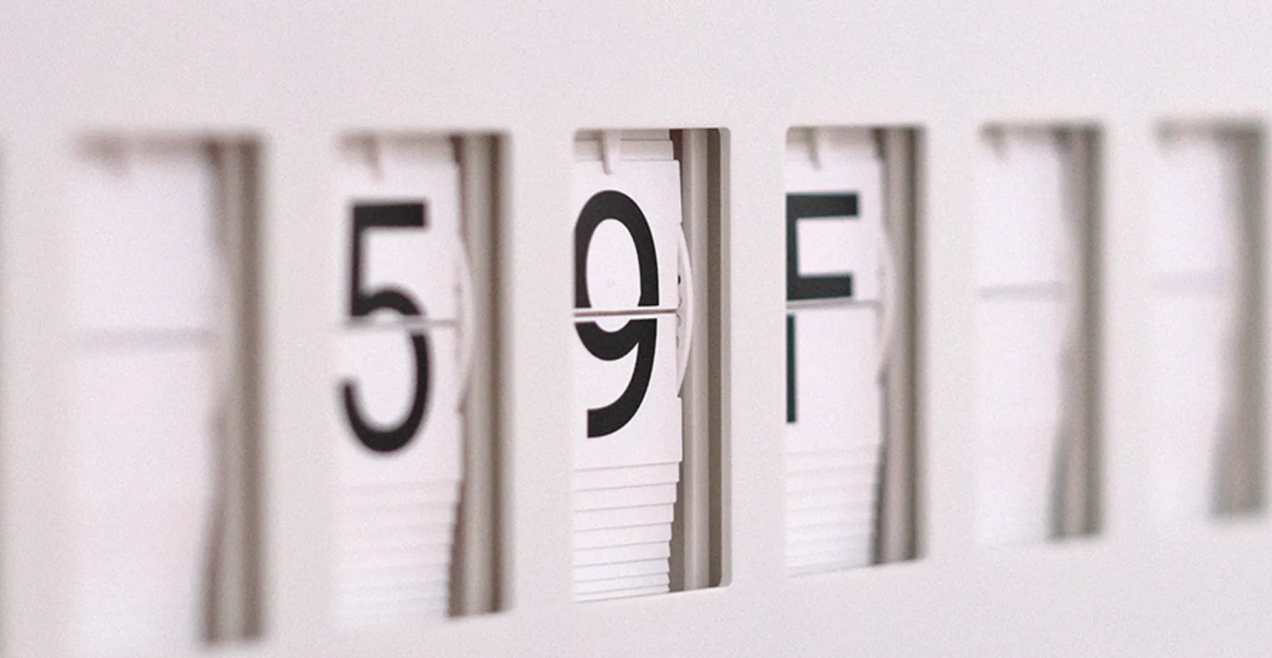
Vestaboards cycle through characters on each tile until they settle on the target message
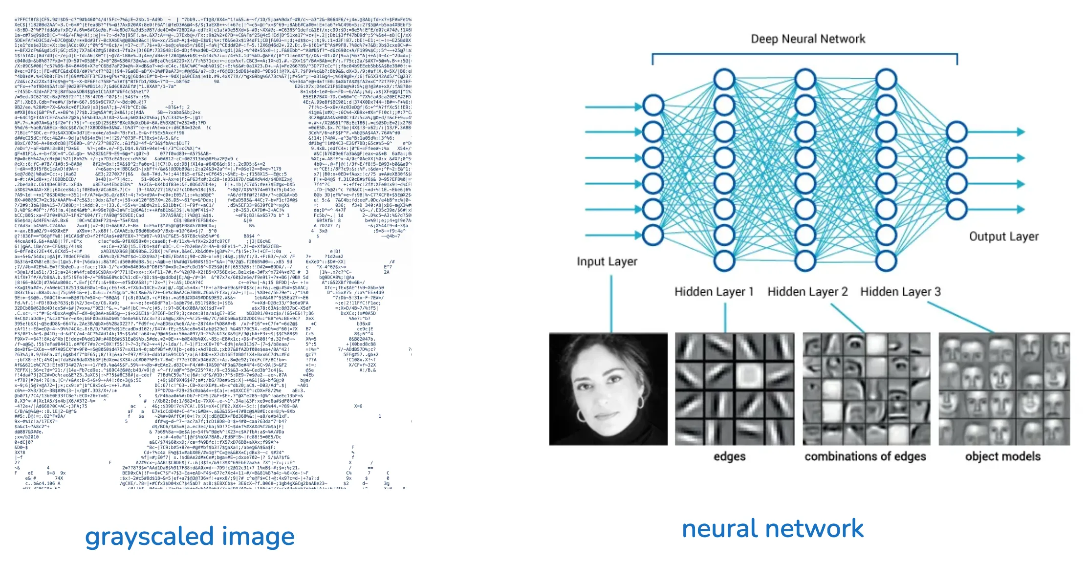
The art plays a diffusion-like denoising effect on first page load — random noise iteratively converges on something legible. You can re-trigger it anytime with the Denoise button, and swiping your cursor across the art wipes characters into noise that slowly recovers. When the image is fully “noisy”, we start to brush up against core concepts in neural networks and computer vision. Most of my close friends could still look at that noisy, grayscale image and say, “yep, that’s Vaidas.”
The image hints at how neural networks learn to identify people — a computer vision model applies convolutions to extract features (e.g. large forehead or a distinctive jaw), by scanning for specific patters of pixel groupings in a grayscale image. These learned features live in “hidden layers” of the neural network, activating when they predict a match. I’ll cover more of this in depth in future posts!
Micro-Interactions
I wanted this site to really feel alive — texture and responsiveness always delight me when I’m browsing a website. This is my favorite area to experiment with, and you can expect tiny changes happening here all the time.
Magnetic hover: links on the homepage subtly gravitate toward the cursor and spring back on leave. Elements feel like they want to be clicked.
Nod animation: Main header nav and social links offer a quick nod on hover — a vertical dip, with the downstroke faster than the recovery.
Sliding dot indicator: a tiny dot slides beneath main nav buttons as the cursor moves across them, fading in on entry and out on leave.
Blog Layout
Each blog post gets a sticky table of contents that tracks scroll position and highlights the current section. Headings are auto-linked so every section is deep-linkable, in case people want to share or reference a specific section.
Images in posts can opt into a hover-expand glass panel effect or a click-to-expand lightbox. Magnetic hover also carries into prose links, keeping the same tactile feel as the homepage.
SVG Animations
I’m just dipping my toes into SVG animations, but I’m excited to experiment with them further for dynamic visualizations to communicate concepts in my blog posts. Animating a forward pass through a neural network is something I’ve had in mind for a while — hover to see it in action! This effect forms the header of the blogs list page, and I think it really connects my past and present. The animation reminds me of how loadpaths flow through a finite element stick-frame model in structural engineering.
If you see any cool applications of SVG animations out in the wild, please let me know!
Glassmorphism & Neumorphism
I’m experimenting a bit with glassmorphism across the site — the sticky header uses a frosted blur with layered gradients, the About page photo carousels sit in glass-framed thumbnails, and blog banners and lightboxes lean on translucent layers and soft borders. I’ve slipped in a bit of neumorphism too, with subtle shadow work on some image frames. Restraint is the main challenge here… overuse of these patterns can definitely start to steal attention from the content.
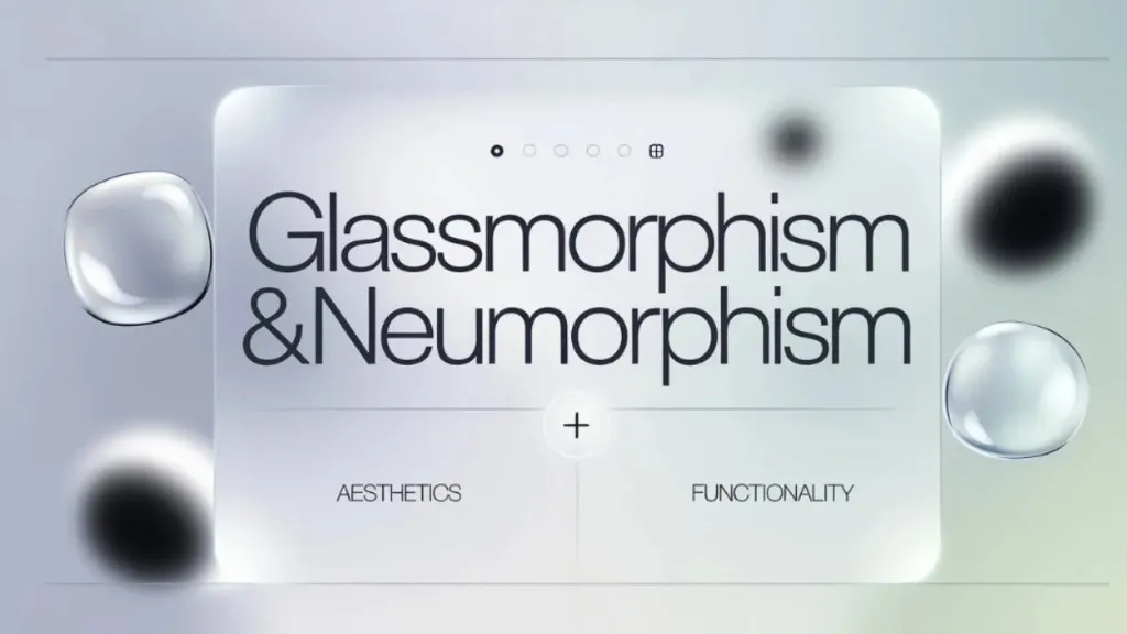
Image credits: Design Studio UI/UX
What to expect from the blog
I’m hoping to write about topics I take a strong stance on: AI/ML, integrating it into the built environment, and the business landscape of AI more generally.
Thanks for reading!